10 Easy Ways To Build Data Visualisation Into Your Reports
- Home
- Articles
- Data Analytics
- 10 Easy Ways To Build Data Visualisation Into Your Reports

Data visualisation is not just a trend. It’s becoming best practice when presenting data. This includes in reports, presentations, advertising and even via social media.
Why is Data Visualisation so powerful?
From research we know that data visualisation:
• Quality infographics are 30 times more likely to be read than text articles[i]
• The number of people believing a scientific claim grows from 68% to 97% when you include a graph.[ii]
• Written information is 70% more memorable when it is combined with visuals and actions[iii]
• Visual language improves problem-solving effectiveness by 19%[iv]
• Visual language produces 22% higher results in 13% less time[v]
And if that doesn’t convince you, visual language has been shown to shorten meetings by 24%![vi]
It can, however, be trick to know how to incorporate data visualisation into your reports and presentations. Therefore, we are sharing 10 easy ways to build data visualisation into your every day business activities.
10 Easy Ways To Build Data Visualisation Into Your Reports
Jump to a section here:
1. Simple But Effective Graphs
2. Build In Benchmarking
3. Use Some Colour Coding
4. Get Creative With Infographics
5. Don’t Forget About Tables
6. Show Complex Results With Heatmaps Success
7. Display Success With A Scorecard
8. Use Timelines To Visualise A Journey
9. Leverage Maps To Demonstrate Statistics
10. Create A Dashboard For An Executive Summary
1. Simple But Effective Graphs
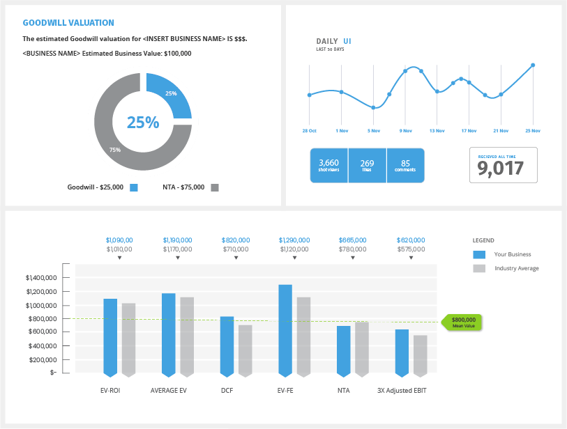
One of the most common ways to visualise data is via a graph. Graphs are effective and provide the viewer with a quick visual representation of data. When using graphs, it is important to not overcomplicate it. Majority of graphs work best with one data set.
Basic graphs can be created easily using MS Excel, however, it is important to choose the right graph for the right data set. If you’re unsure which graphs to use, keep it simple. There is nothing wrong with a bar chart, pie chart or line graph!
2. Build In Benchmarking
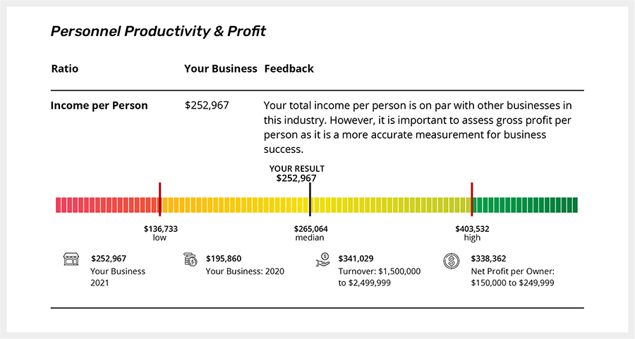
Benchmarking is an excellent way to visually show how a business is performing compared to a set of standards. Benchmarking can be done against industry peers, internal real results or internally set benchmarks. When displaying benchmarks, it’s important to establish the actual benchmark, as well as a high and low. The example below is from our Business Benchmark Report, you can see our sample Benchmark Report here to see how we present all our benchmarks.
3. Use Some Colour Coding
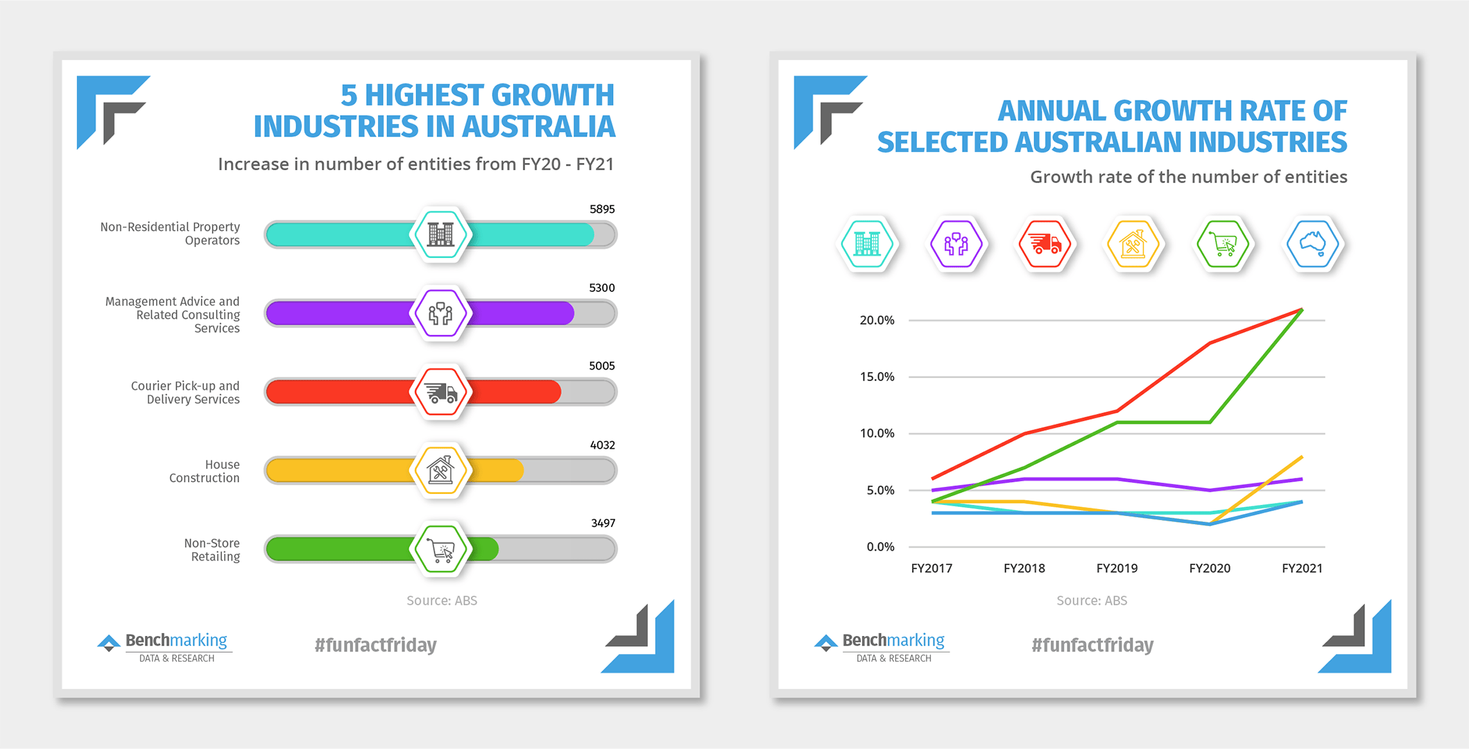
Colour coding can simplify data and graphs greatly. This technique can be particularly powerful when you want to represent the same data set multiple times but want a clean representation. You can also use colour across a document to represent a certain data point. Below we have shown how colour combined with icons can be used when representing the same data set cut tow different ways.
4. Get Creative With Infographics
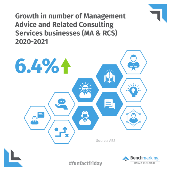
Infographics are one of the most powerful data visualisation tools. They don’t have to be complex. In fact, a simple infographic is often more effective. When creating infographics, it’s important to ensure the data – or result you want to present – is the hero of the image. Using visuals that relate to the topic is also vital as this will help your audience remember the message. We also recommend combining traditional graphs with graphics to capture the audience interest and attention.
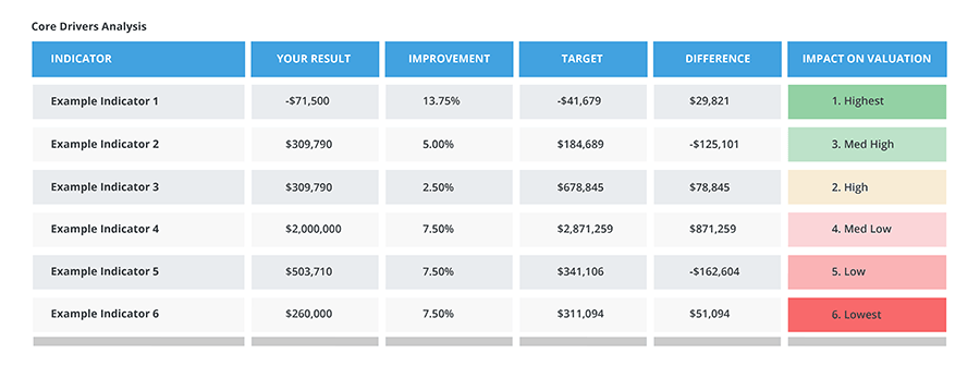
5. Don’t Forget About Tables
Tables are sometimes overlooked when discussing data visualisation. However, it all comes down to how it is presented. Colours and shading are simple ways to support the reader dissect the information. Further, it is often easier to read tables when they include a mix of text, numbers and results. The key take away is to keep it simple and clearly showcase the result.
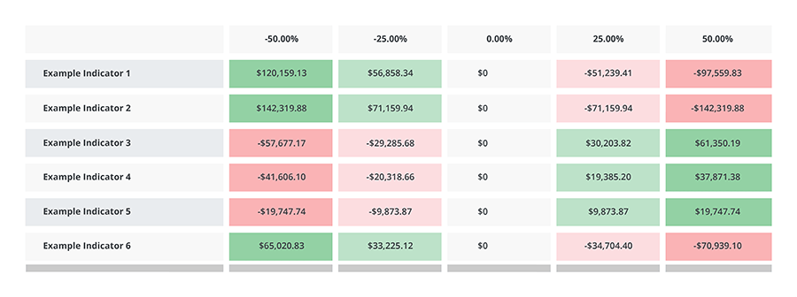
6. Show Complex Results With Heatmaps
Heat maps can show complex results quickly due to the fact that humans associate green with good and red with bad. Thus, using this concept, large portions of data can be represented and understood. It is simple to create a heat map in excel using the conditional formatting settings. However, when creating a heat map, it is vital that you select which data you are comparing. You should create a new heat map line, or data set for each result you want to portray.
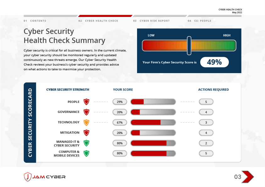
7. Display Success With A Scorecard
Using the same colour principles as the heat map, a scorecard can show managers immediately if a company is achieving their performance objectives. It can focus attention on areas that require it and support skim readers to zone in on key facts.
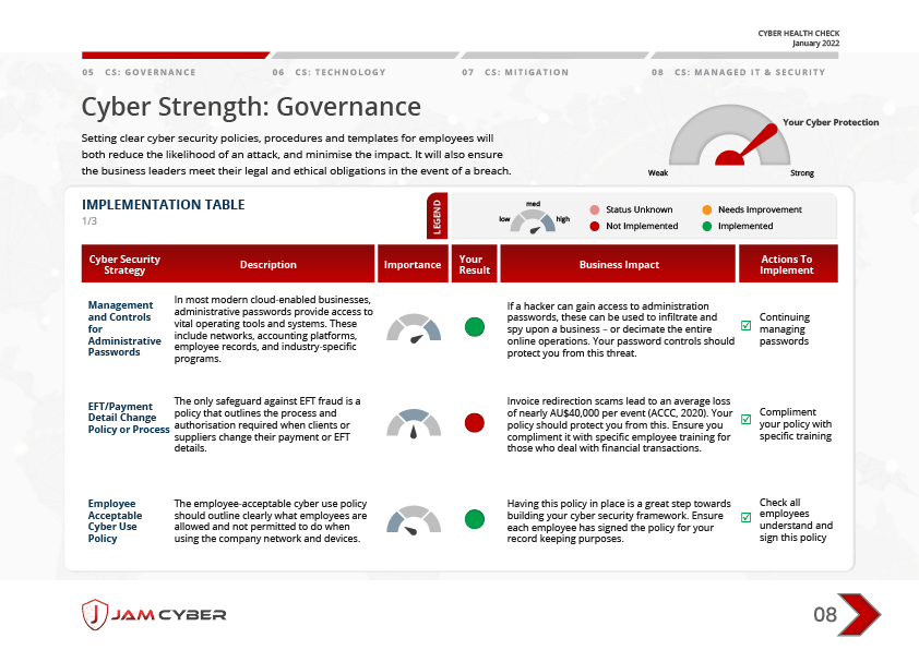
Image source: jamcyber.com
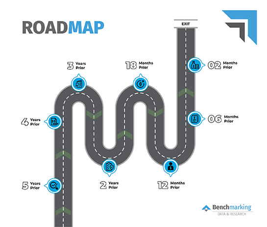
8. Use Timelines To Visualise A Journey
Timelines are a great way to tell a story. They can highlight how far a company has come, or showcase the road ahead. Timelines are also an excellent way to display minimal but in depth data – such as company growth year on year – creatively. Timelines can also be used to demonstrate a future plan or direction. For example, the Benchmarking Exit Strategy Road Map breaks down the years so users can easily see the future steps they need to take.
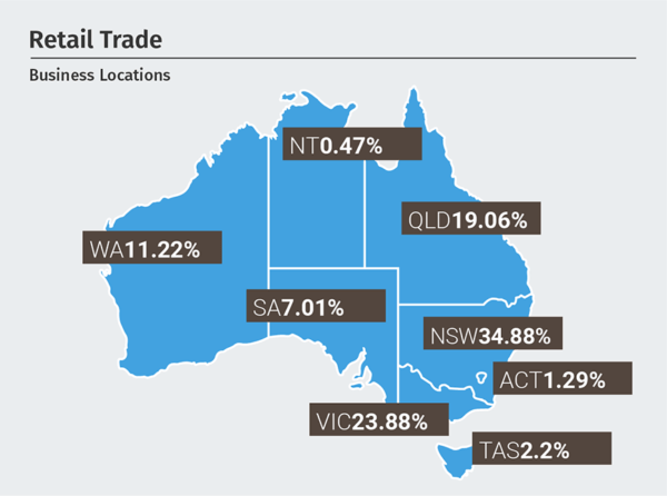
9. Leverage Maps To Demonstrate Statistics
Maps are excellent visual tools as they create relevance for people who view them Instead of a table, they can quickly show a geographic comparison across many locations. You can create a map graph in MS Excel under the ‘charts’ section. Or, get creative and your own with unique data and trends.
10. Create A Dashboard For An Executive Summary
A dashboard is the new Executive Summary. The beauty of a dashboard is it can be used in a physical report, as part of a scheduled presentation or on a website as a promotional tool. In the same vein as an executive summary, a dashboard should be short and sweet and cover all the key facts. This can be achieved by using a variety of the above visualisation techniques such as scorecards, benchmarking, infographics and charts.
Final Tips For Creating Data Visualisation In Your Reports
1. Ensure the data insight/result is the hero: don’t let ‘creativity’ distract from the key point.
2. Don’t forget some text: graphs and visual tools need some explanation so this can’t be forgotten completely
3. Get help! Benchmarking has numerous reports as part of our Benchmarking Suite; all which use data visualisation to showcase your client’s business performance.
Want to create visual reports for your clients?
References
[i] https://www.easel.ly/blog/the-best-videos-about-infographics/
[ii] https://journals.sagepub.com/doi/10.1177/0963662514549688
[iii] https://www.amanet.org/articles/using-visual-language-to-create-the-case-for-change/
[iv] https://www.amanet.org/articles/using-visual-language-to-create-the-case-for-change/
[v] https://www.amanet.org/articles/using-visual-language-to-create-the-case-for-change/
[vi] https://www.amanet.org/articles/using-visual-language-to-create-the-case-for-change/
