Why You Should Be Using Data Visualisation For Business
- Home
- Articles
- Data Analytics
- Why You Should Be Using Data Visualisation For Business
Data visualisation for business is more than just cool infographics. It can improve business performance, drive strategic decision making and even shorten team meetings.
What makes data visualisation such a powerful tool for business owners?
We look at 10 facts behind why data visualisation is such a vital tool for business.
Why Data Visualisation for Business is so Important
Jump to a section here:
- 65% of the world’s population are visual learners.
- The human brain can process images in as little as 13 milliseconds.
- Groups using visual language experienced a 21% increase in their ability to reach consensus.
- Visual language improves problem-solving effectiveness by 19% in 13% less time.
- Readership rate of content increases by 80% when it includes visuals like charts, graphs, images and color design.
- Organisations can shorten their business meetings by 24% using data visualisation.
- Companies that use data visualisation are 5 times more likely to make faster decisions and 3x more likely to execute them than their competitors.
- Analytics delivers the average benefit of $9.01 per dollar spent.
- Human brains process visuals 60,000 times faster than they do text.
- People who follow directions with illustrations do 323% better than those who follow text-only directions.
1. 65% of the world’s population are visual learners.
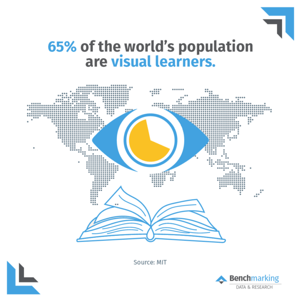
65% of the world’s population are visual learners. This means only 1 in 3 are classified as auditory learners, readers, and/or kinaesthetic learners.
When educating employees or customers, using various communication methods can support the audience grasp your key takeaway faster. It will also be more engaging for majority of people.
2. The human brain can process images in as little as 13 milliseconds.
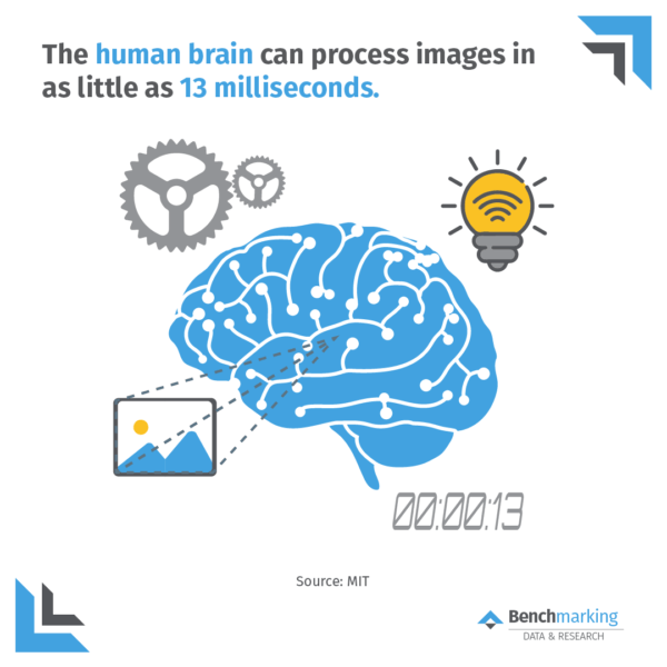
The human brain rapidly digests images. Using images in addition to text explainers is an effective way to communicate complex messages, statistics or large quantities of information. Further, images can be beneficial when delivering long presentations or reports to ensure key takeaways are not missed.
3. Groups using visual language experienced a 21% increase in their ability to reach consensus.
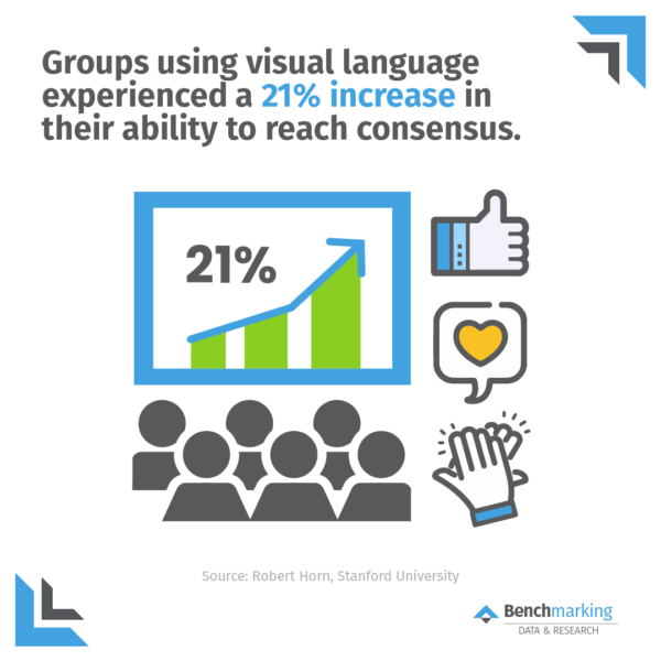
Groups using visual language experience a 21% increase in their ability to reach consensus. This is because visualising your message (and/or #data) brings peers along the journey with you, rather than just being told what is happening. Thus, peers can clearly identify the problem and engage together to form viable solutions.
4. Visual language improves problem-solving effectiveness by 19% in 13% less time.
This fact shows that data visualisation can reduce a 1-hour meeting by 8 minutes! Further, they can be fundamental in helping employees understand problems; thus fundamental in solving problems. This can lead to more productive decision making and effective teamwork.
5. Readership rate of content increases by 80% when it includes visuals like charts, graphs, images and color design.
Colours and graphs engage users by making facts and statistics easier to understand. This increases the readership rate of content by 80%! This is particularly important when creating short form content (such as social media). Mangers can use data visualisation for business engagement.
6. Organisations can shorten their business meetings by 24% using data visualisation.
Studies have continuously shown that when using data visualisation for business, teams can dramatically shorten meetings. This is because visualising data hastens understanding and decision making.
7. Companies that use data visualisation are 5 times more likely to make faster decisions and 3x more likely to execute them than their competitors.
When using data visualisation for business, not only is it easier for teams to make decisions, but research shows that team are 3x more likely than competitors to implement their decisions. This can lead to improved business innovation, productivity and performance.
8. Analytics delivers the average benefit of $9.01 per dollar spent.
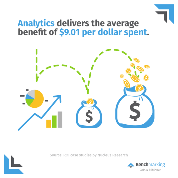
Businesses who invest in analytics gain an average benefit of $9.01 per dollar spent. The research undertaken behind this fact stated that:
“The primary outcomes driving these returns were increased productivity from time savings, avoided costs such as additional hires or hardware purchases, and increased profitability such as through the enablement of a new revenue-generating strategy.”
9. Human brains process visuals 60,000 times faster than they do text.
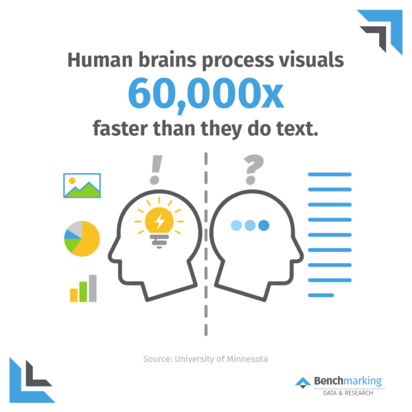
Humans love images. Our brains thrive on it. Images don’t just help to tell a story; they give the audience a greater understanding of the core message you are trying to convey. This supports humans process visuals much faster than processing text. Thus, it’s vital to always include images in business reports and when talking about data and trying to convey a message.
10. People who follow directions with illustrations do 323% better than those who follow text-only directions.
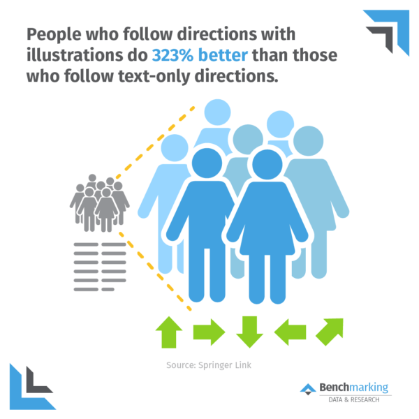
It’s no surprise visualising directions is extremely effective. It’s now a given that physical directions are given visually. However, this concept can be applied to more than walking around a theme park. Business leaders can also visualise company goals to help employees understand the big picture. Additionally, the practice can be used when explaining online platforms, training customers and for personal goals.
Using Data Visualisation For Business
Find out how to incorporate data visualisation into your every day business life with our list of 10 Easy Ways To Build Data Visualisation Into Your Reports.
Or, start your data visualisation journey today! You can try our Benchmarking Suite and turn your client’s profit and loss into an insightful business analysis highlighting their strengths, opportunities and true value.
